In this article we are going dive into spacing systems, we will explore what a spacing system is and how it can help you design with confidence and consistency. We will then discuss how to implement a spacing system using GatsbyJS and Styled Components.
Prerequisites
- As we will be cloning a starter project from Github, basic git and command line knowledge is recommended
- You will need node and npm installed on your machine to run the app and install the any dependencies
- Basic understanding of React is recommended but not required
What the heck is a spacing system, anyway?
A spacing system is simply a set of predefined spacing values that your designs always adhere to. Not only does a spacing system help you design faster, they can also speed up your development process and provide confidence when positioning elements.
Web design is hard. If you are anything like me, then you often look at a beautifully designed website and struggle to pin down actually what aspects make it look good. Compared to development where there is often a clear right wrong approach to a problem, I find the subjective nature of design a real challenge. Having a consistent spacing system in place for approaching a design helps a lot.
Where can I find a spacing system?
You might be wondering where to find a spacing system of your own. You can’t just simply pluck some random values from thin air, right?
For my spacing values, I like to “steal like an artist” and lean on the skills and experience of other designers that are more qualified than I am. My spacing system comes from a fantastic booked called Refactoring UI by Steve Schoger and Adam Wathan. Steve is a brilliant designer, in Refactoring UI he shares this spacing scale that I reach for in most of my projects:

Using this scale results in consistent spacing across all screen sizes as it can be calculated by using a base font size. For example, you may use a base font size of 15px on mobile which increases to 16px at larger screen sizes, using a scale like this will adjust the values accordingly.
Setting up the GatsbyJS project
To create our spacing system we are going to use a basic starter project that includes gatsby, styled-components and some bare-bone components.
To get started, clone the repository found here to your machine:
bash
git clone https://github.com/lukejohnbrown/styled-components-spacing-system.git
Once complete, you will need to install the project dependencies by running npm install from within the project directory:
bash
cd styled-components-spacing-system
bash
npm install
As you now (hopefully 🤞) have all of the project dependencies installed, you can start the app by running npm start in your terminal:
bash
npm start
If all goes well, you should see the application running in your web browser at localhost:8000:
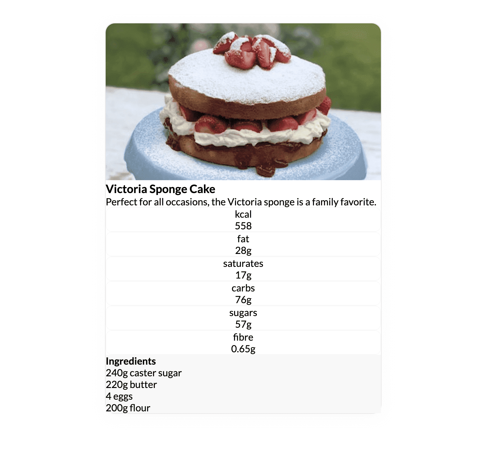
Our starter project contains a simple recipe card that is looking rather dull. To jazz it up a bit we are going to implement our spacing system and give the recipe card some much-needed spacing.
Creating the Theme Using Styled Component's ThemeProvider
One of my favorite features of styled-components is the ability to provide a theme for your project, which can then be referenced in all of your styled components.
To implement our theme, open the project in your code editor of choice and navigate to the Layout component, which can be found at src/components/Layout.js.
jsx
import React from "react";import { createGlobalStyle } from "styled-components";const GlobalStyle = createGlobalStyle`* {box-sizing: border-box;padding: 0;margin: 0;}body {font-family: 'Lato', serif;}`;const Layout = ({ children }) => {return (<><GlobalStyle /><main>{children}</main></>)};export default Layout;
This is our base layout component that is used to wrap all pages to provide app-wide structure and styling.
Within this Layout component, we are:
- Applying basic global reset styles using
createGlobalStylefromstyled-components, these styles are applied to all child elements that make use of thisLayoutwrapper. - Returning any provided child components wrapped in a
<main />tag. If you are not familiar with this common React pattern, it may make more sense when we dive into the other components.
Using the styled-components library, we can now create a theme that will import the spacing values we discussed earlier.
Let's start by creating our theme object by adding the following to the top of the Layout component:
jsx
...const theme = {space: ["0.25rem","0.5rem","0.75rem","1rem","1.5rem","2rem","3rem","4rem","6rem","8rem","12rem","16rem","24rem",]}...
We now need to make this theme available to any children components by using a Provider. To do this, we first need to extend our imports from styled-components to include ThemeProvider:
jsx
import { createGlobalStyle, ThemeProvider } from "styled-components";...
We can then pass our theme to the ThemeProvider as a prop and include it in our exported JSX.
Your Layout.js file should now look like this:
jsx
import React from "react";import { createGlobalStyle, ThemeProvider } from "styled-components";const GlobalStyle = createGlobalStyle `* {box-sizing: border-box;padding: 0;margin: 0;}body {font-family: 'Lato', serif;}`;const theme = {space: ["0.25rem","0.5rem","0.75rem","1rem","1.5rem","2rem","3rem","4rem","6rem","8rem","12rem","16rem","24rem",]}const Layout = ({ children }) => {return (<ThemeProvider theme={theme}><GlobalStyle /><main>{children}</main></ThemeProvider>)};export default Layout;
You can include any values within this theme and all subsequent components that use styled-components will have access to those values.
How are our theme values being made available to other components?
Styled Components uses React Context to expose theme values and make them available to child components (which is why we wrapped our existing components with the ThemeProvider).
You can read more about React Context here.
Using the theme to style our recipe card component
Now that we have set up our theme, it is time to start adding some much-needed spacing to our recipe card component.
In your code editor, open the RecipeCard.js file, which can be found at src/components/RecipeCard.js:
jsx
import React from 'react'import styled from "styled-components";import Nutrition from "./Nutrition";import Ingredients from "./Ingredients";import cakeImage from "../images/cake.jpg";const RecipeCardWrapper = styled.div`box-shadow: 0px 4px 20px rgba(222, 222, 222, 0.25);border: 1px solid #F8F8F8;border-radius: 15px;`;const RecipeCardHeader = styled.div`/* We need some spacing styles here */`;const RecipeCard = () => {return (<RecipeCardWrapper><img src={cakeImage} alt="Victoria Sponge Cake" /><RecipeCardHeader><h3>Victoria Sponge Cake</h3><p>Perfect for all occasions, the Victoria Sponge cake is a family favorite.</p></RecipeCardHeader><Nutrition /><Ingredients /></RecipeCardWrapper>)};export default RecipeCard;
There is a lot happening in this file, so let's explore it step by step:
After importing the 3rd party dependencies at the top of the file we are importing the
NutritionandIngredientscomponents that are used to make up the body of the recipe card (more on this later).After the imports, we are creating two styled components for our recipe card that includes some basic
CSS.We are then exporting the
RecipeCardcomponent, which includes an image of a delicious cake and theNutritionandIngredientscomponents we imported at the top of the file.
Applying our first padding styles
Let's start by applying some spacing to the RecipeCardWrapper styled component. The RecipeCardHeader styled component that is wrapping the title and subtitle could with some padding:
jsx
...const RecipeCardHeader = styled.div`padding: ${(props) => props.theme.space[4]};p {margin-top: ${props => props.theme.space[1]};}`;...
This is made possible by using template strings as they allow us to run JavaScript within the string (note the backticks wrapping the CSS). We are calling a function that receives props as the first argument, props is an object containing our theme so we can access the space object and return the desired value as padding.
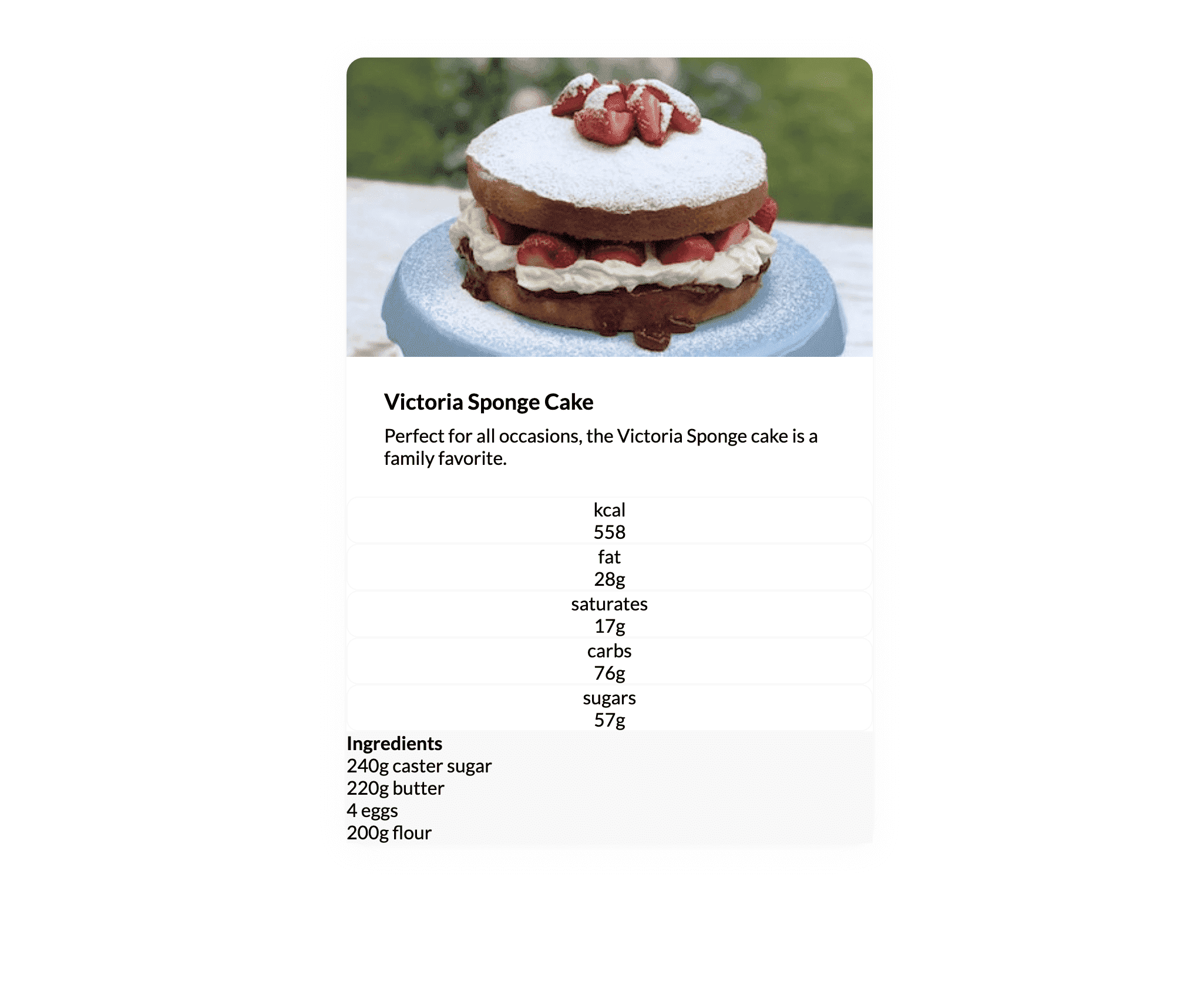
If you now check out the app in your browser you will notice the additional spacing around the header of our recipe card - it is starting to look better already:
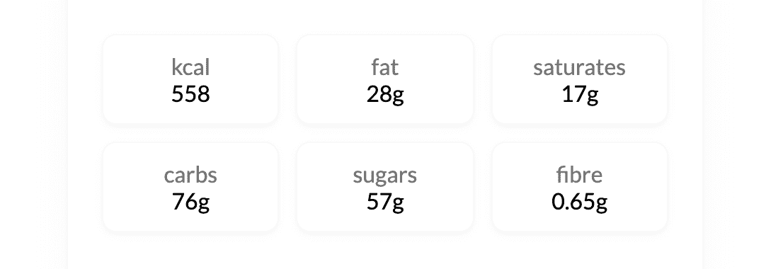
Styling the recipe card nutritional stats
Next up, we are going to style the sad-looking nutrition section of our recipe card. If you open the Nutrition.js file in your code editor you will find two styled components, the first being the NutritionWrapper which is used to wrap our entire component and the second called NutritionItem which wraps each nutritional value:
jsx
import React from 'react'import styled from "styled-components";const NutritionWrapper = styled.div`display: grid;`;const NutritionItem = styled.div`border: 1px solid #eee;border-radius: 10px;text-align: center;`;const Nutrition = () => (<NutritionWrapper><NutritionItem><span>kcal</span><p>558</p></NutritionItem><NutritionItem><span>fat</span><p>28g</p></NutritionItem><NutritionItem><span>saturates</span><p>17g</p></NutritionItem><NutritionItem><span>carbs</span><p>76g</p></NutritionItem><NutritionItem><span>sugars</span><p>57g</p></NutritionItem></NutritionWrapper>);export default Nutrition;
If you feel comfortable adding the spacing styles for this component yourself, then please don't hesitate to give it a shot.
This is how I would approach the CSS to improve the look of this component:
jsx
const NutritionWrapper = styled.div`display: grid;grid-template-columns: 1fr 1fr 1fr;grid-gap: ${props => props.theme.space[2]};padding: 0 ${props => props.theme.space[4]};`;const NutritionItem = styled.div`border: 1px solid #f8f8f8;border-radius: 10px;text-align: center;padding: ${props => props.theme.space[2]};box-shadow: 0px 2px 5px rgba(218, 218, 218, 0.25);span {color: #747474;}`;
By using the values of our spacing system to apply padding and margin, we can be confident that the outcome will look good:
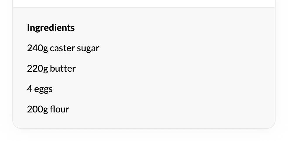
Last but not least, we can add some spacing to the Ingredients component of our recipe card:
jsx
import React from 'react'import styled from "styled-components";const IngredientsWrapper = styled.div`background: #f8f8f8;padding: ${props => props.theme.space[4]};margin-top: ${props => props.theme.space[4]};border-top: 1px solid #e8e8e8;border-bottom-left-radius: 15px;border-bottom-right-radius: 15px;p {&:not(:last-child) {margin-bottom: ${props => props.theme.space[3]};}}`const Ingredients = () => (<IngredientsWrapper><p><strong>Ingredients</strong></p><p>240g caster sugar</p><p>220g butter</p><p>4 eggs</p><p>200g flour</p></IngredientsWrapper>);export default Ingredients;
The end result
That about sums it up for all our additional styling, with the help of our spacing system the recipe card now looks a lot less cluttered:
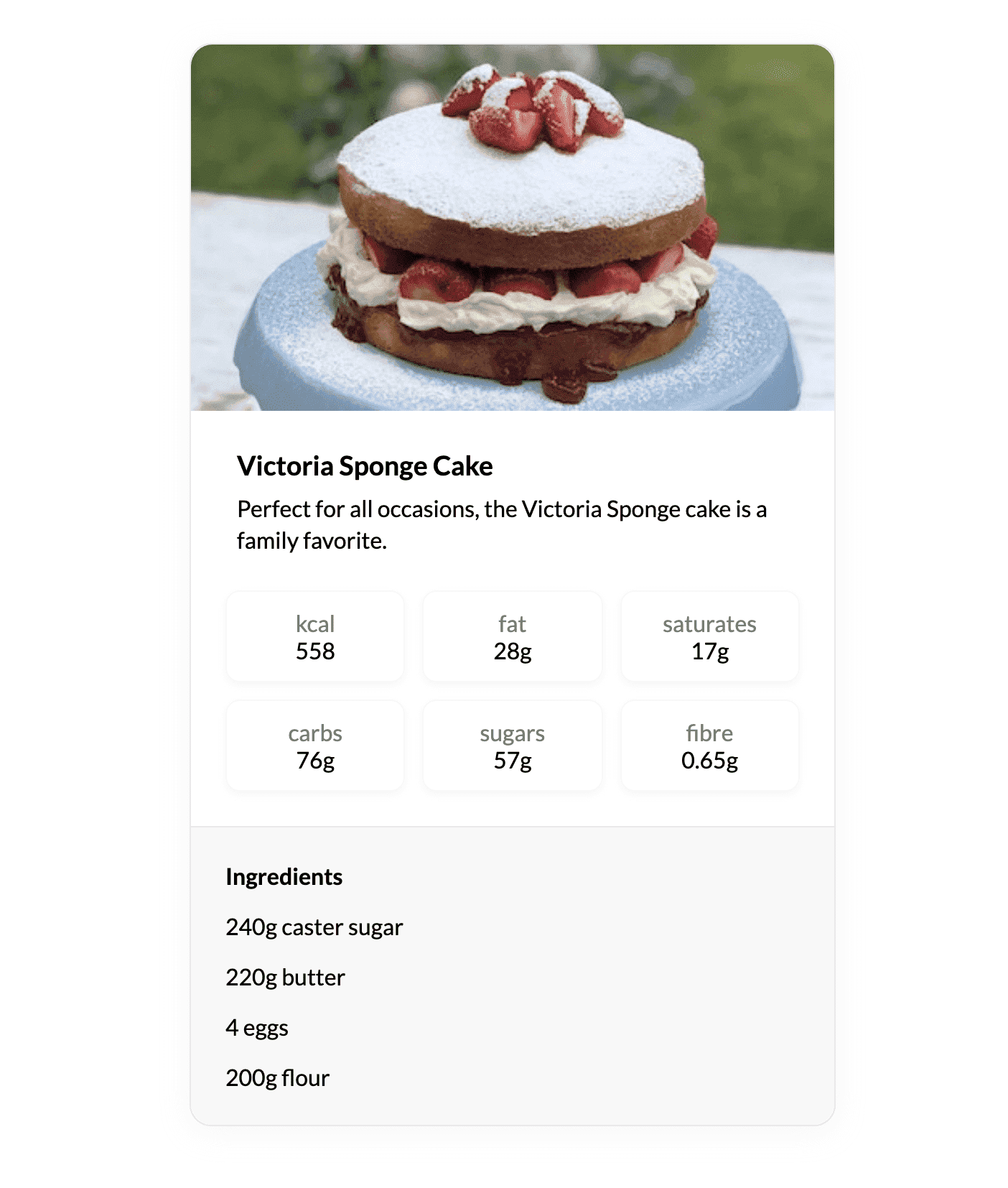
You can now hopefully see how powerful a spacing system can be when used to style your components. Knowing that all your padding and margin values are being sourced from a trusted spacing scale should provide more confidence when applying CSS.
Now go forth, and space your components with confidence!