Don't like reading? Watch this tutorial on YouTube (and don't forget to subscribe while you are there).
Stripe’s website is often used as an example of excellent web design, and you can see exactly why. I particularly like the background effect used within their banner, so I decided to figure out how to build it using CSS Grid.

Although (hopefully) it goes without saying, the design and colors used within this post are all borrowed and inspired by stripe.com.
Dissecting the Banner
The first thing you notice about the banner is that it is presented at an angle. This makes it difficult to investigate, so if you remove the transform: skew() style applied to the banner wrapper you get an idea of how it looks when straight:

Initially, I assumed that this style was achieved by using a background image, but it turns out it is simply a collection of five <span> elements wrapped in a <div>.
Each <span> has a different background color and position to make up this neat gradient effect, which you can see demonstrated here:
Although Stripe uses absolute positioning to here (which is likely for better browser support), this is pretty straight forward to achieve with CSS Grid.
The Solution with CSS Grid
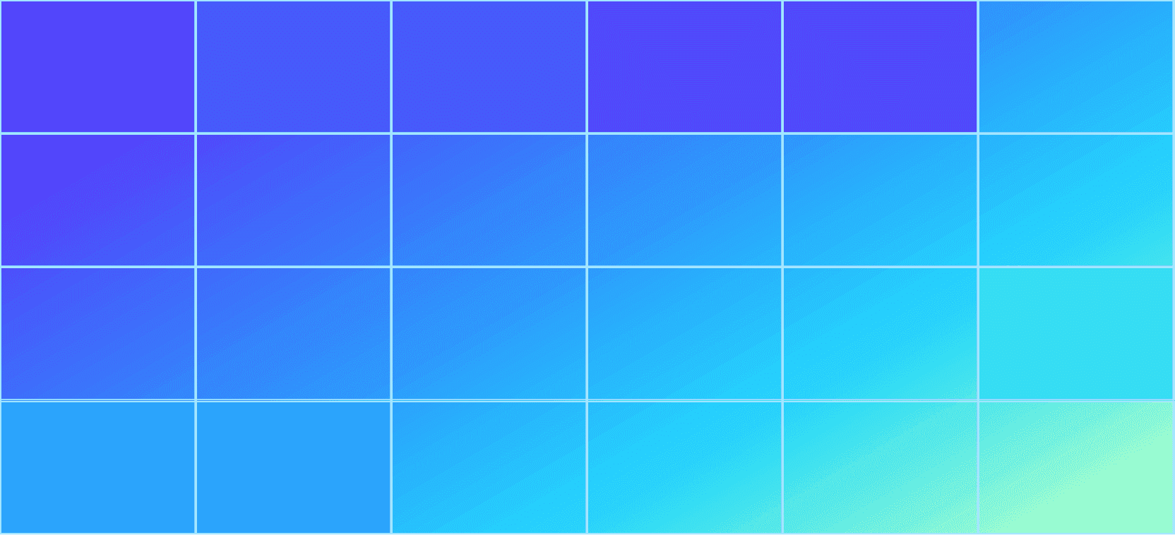
When building with CSS Grid, it helps to visualize the layout as a grid (which sounds obvious when you say it out loud). As you can see, the Stripe banner is a grid made up of 6 columns and 4 rows:
Using the same markup as Stripe, we can start by defining our HTML:
html
<div id="stripes"><span></span><span></span><span></span><span></span><span></span></div>
Let's start by applying some CSS to the wrapper element, which has a background gradient and a display property of grid with 6 columns and 4 rows. We also have to define an explicit height as we are not including any content within the banner that would traditionally give it a height.
css
:root {--background: linear-gradient(150deg, #53f 15%, #05d5ff 70%, #a6ffcb 94%);--first: #53f;--second: #4553ff;--third: #4f40ff;--fourth: #25ddf5;--fifth: #1fa2ff;}#stripes {width: 100%;height: 35vw;background: var(--background);display: grid;grid-template-columns: repeat(6, 1fr);grid-template-rows: repeat(4, 1fr);}
What is that funky syntax at the start of our CSS?
We are using CSS variables to define the gradient background of the banner and the background color of each block.
Styling the blocks
After styling the wrapper of our banner, this is the base that we have to work with:

We now need to style the individual <span> elements that make up the effect. To do this we are going to use the nth-child() pseudo selector to avoid having to apply unnecessary class names.
Let’s start by styling our first “block”, which occupies one column in the first row of our grid:
css
#stripes span:nth-child(1) {grid-column: span 1;background: var(--first);}
By using the grid-column property we can dictate where this element sits within the grid. By default, the first element starts at column 1 in the first row, so we simply have to specify how many columns this <span> should cover by using the span syntax.
As this block should occupy 1 out of 6 of our grid columns, we can use the value span 1. You will also notice that we are referencing a CSS variable that we defined earlier.
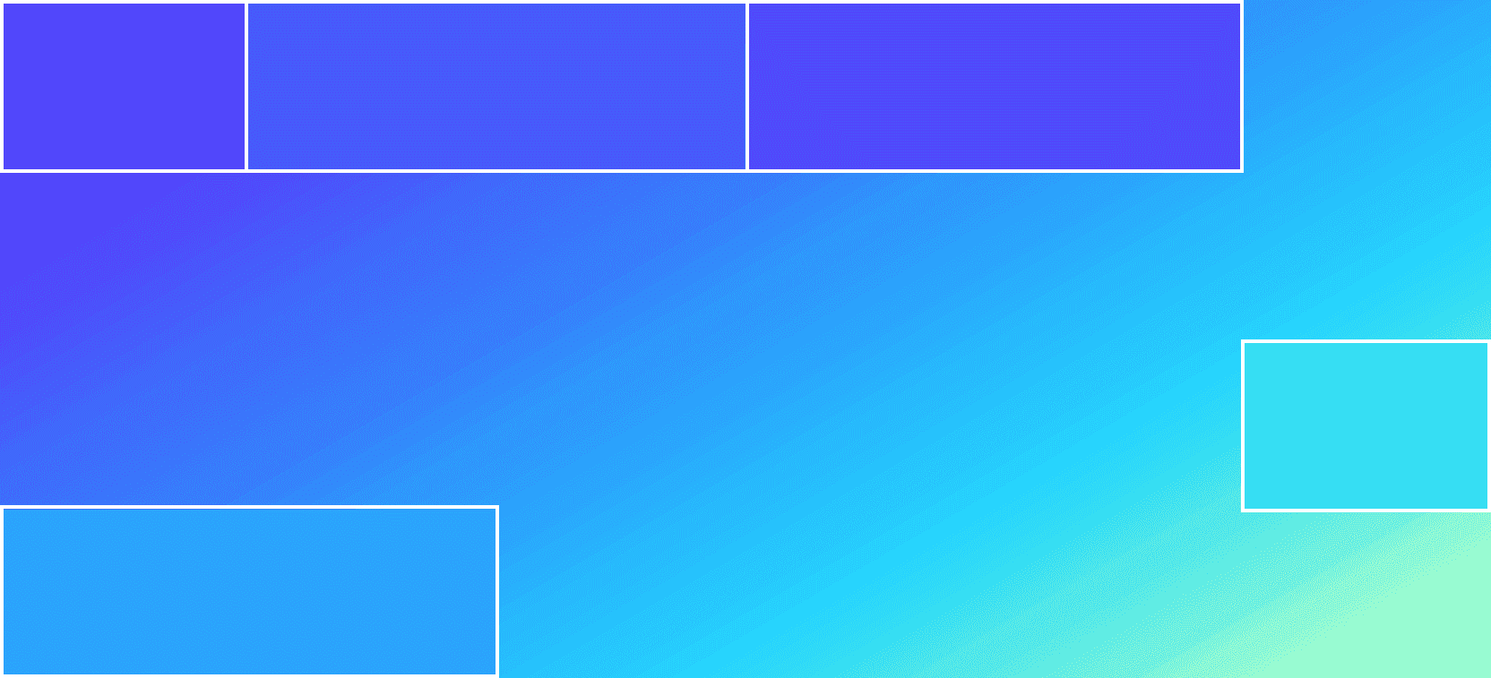
We now have our first block in the top left corner of our banner, but it is difficult to see without any companion blocks. So, let's style the second block, which should occupy 2 columns from its current position:
css
#stripes span:nth-child(2) {grid-column: span 2;background: var(--second);}
We can now start to see our banner coming together:

The final block within the first row of our grid also occupies 2 columns, but has a different background color:
css
#stripes span:nth-child(3) {grid-column: span 2;background: var(--third);}

You may have noticed that there are no blocks in the second row of the grid. Therefore, we can specify that the fourth <span> sits within the third row by using the grid-row property.
This block also sits within the last column of our grid:
css
#stripes span:nth-child(4) {grid-column: 6;grid-row: 3;background: var(--fourth);}

Finally, we can add the fifth block to the first two columns of the 4th row:
css
#stripes span:nth-child(5) {grid-column: span 2;grid-row: 4;background: var(--fifth);}

"Skewing" the banner
Now that we have our 5 <span> elements styled correctly, we need to apply a transform to position the banner at an angle.
This can be achieved by applying a skew transform value to our wrapper element. To do this, simply return to your initial CSS for #stripes and add a transform and transform-origin as specified here:
css
#stripes {width: 100%;height: 35vw;background: var(--background);display: grid;grid-template-columns: repeat(6, 1fr);grid-template-rows: repeat(4, 1fr);transform: skewY(-12deg);transform-origin: 0;}
We are rotating our banner on the Y axis by -12 degrees and specifying that the transform applies to the top left of our banner (remove the transform-origin to see the default behavior!).

Ta-da! We now have a replica of the gradient banner used on Stripe's homepage built with CSS Grid.